Health Platform
Helping doctors order DNA tests and read the results clearly.
- Working with
- Confidential
- Deliverable
- UI/UX · Design system
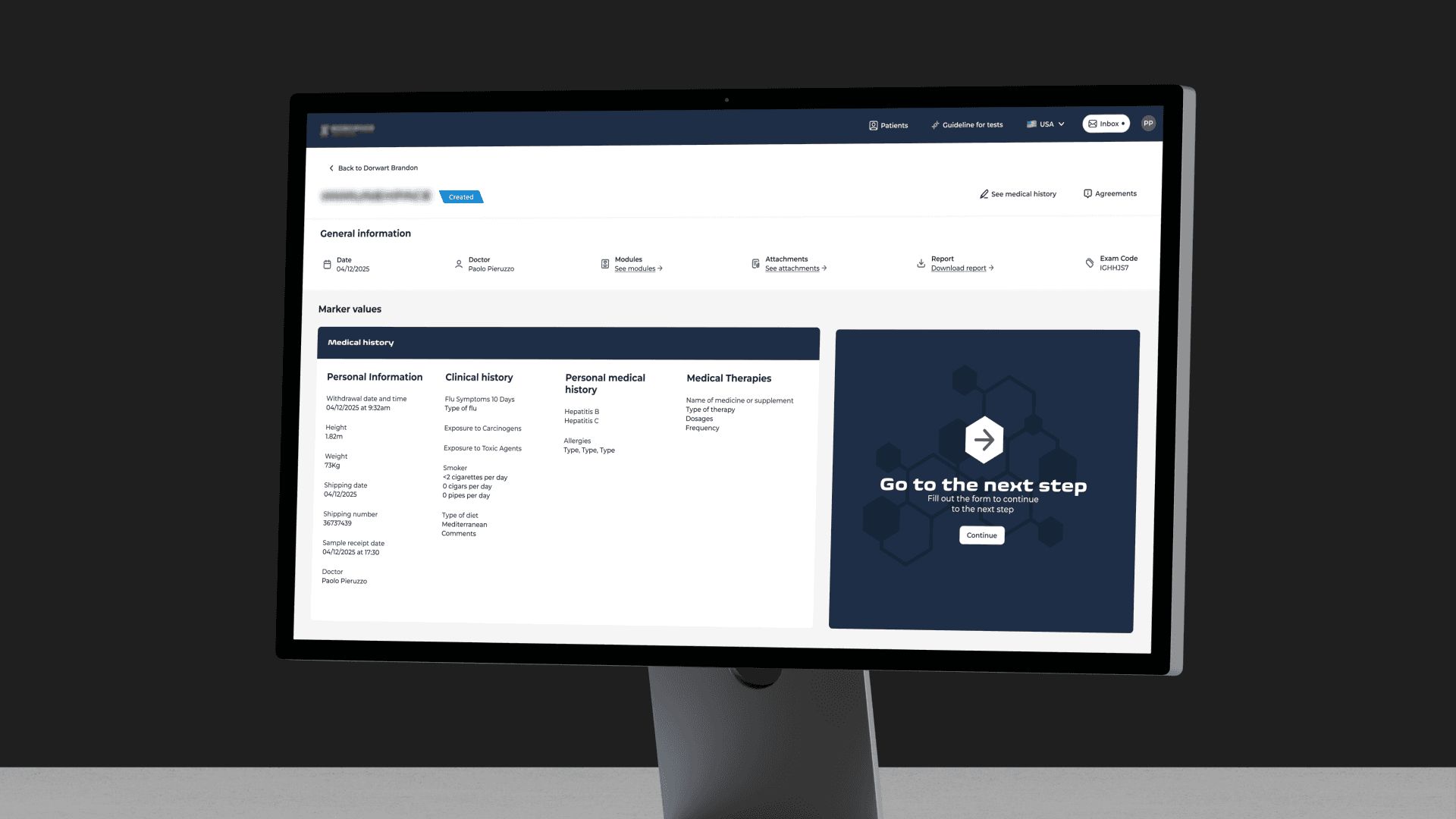
A platform for the doctors who work with a DNA testing laboratory. They use it to order tests, keep each patient’s history in one place and make sense of the results.
~100 markers Documented in a single shared library
12+ reports Patient-facing layouts designed
Everyone had their own setup
The process ran on external software and whatever each doctor had put together for themselves. A patient’s history, their tests and their results lived in different places, and nothing connected the patient directly to the doctor ordering the test.
A hundred markers, and nowhere to look them up
Organizing the data was the easy part. Reading it was harder.
The tests measure biological markers. What a marker means depends on whether it’s above or below its range, and on which other markers are off at the same time. The laboratory’s internal specifications cover all of this, but they’re written for experts, and far too detailed to go through with a patient sitting in front of you.
Three constraints shaped the work. Nothing could be vague, because a misread marker can have serious consequences, which a design mistake usually doesn’t. The design had to grow out of the client’s existing brand instead of replacing it. And the same information had two readers: the doctor, who interprets the results, and the patient, who gets a report.
One library, two ways in
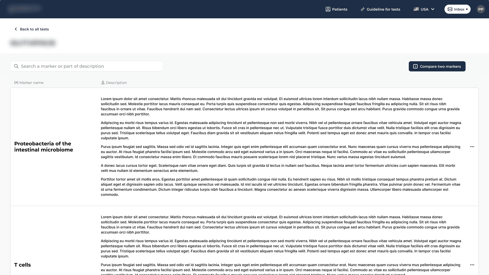
All the laboratory’s tests draw on a shared set of about a hundred markers, and the same marker often appears in several tests.
Instead of explaining each marker again inside every test, I created a single library with every marker, what it does, and what a high or low value means. Doctors can open it from any test or any marker.
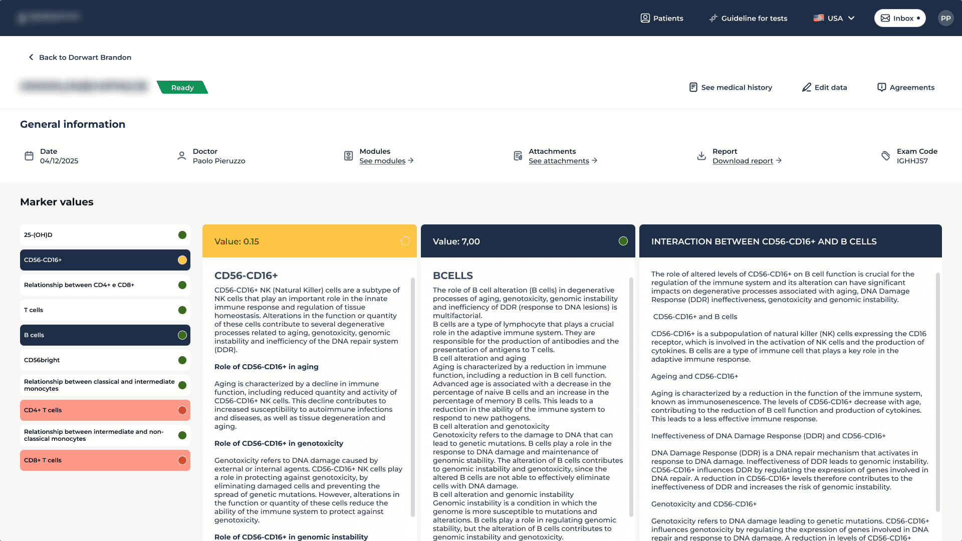
Reading two markers together
Reading results gets hard when more than one marker is off at once.
When a doctor selects two, the platform shows a written explanation of how they interact. Before, that knowledge was buried in the guidelines or in the doctor’s own memory.
Splitting the flow
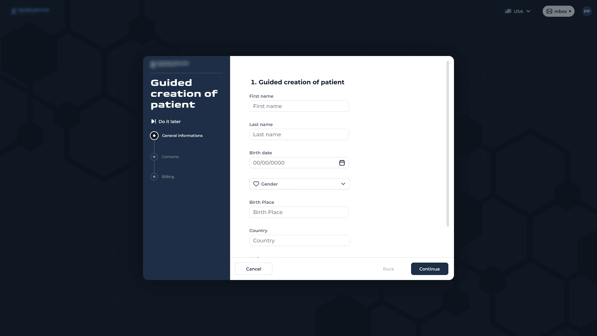
Creating a patient and ordering an exam are separate steps, on purpose.
The patient fills in their medical history through a form sent from the platform. The doctor then finds the record already filled in, reads it as a refresher, edits it if needed, and moves to the exam panel with the patient’s data still on screen. They never have to remember a detail from the previous screen.
The report goes to the patient, the platform stays with the doctor
I designed more than a dozen report layouts that combine values, reference ranges, charts and written explanations.
Patients have no clinical training, so the hierarchy and the wording had to make the results clear without oversimplifying what the numbers say. Every marker shows its range, where the value sits in that range, and what a deviation means, in that order.
One component, in full
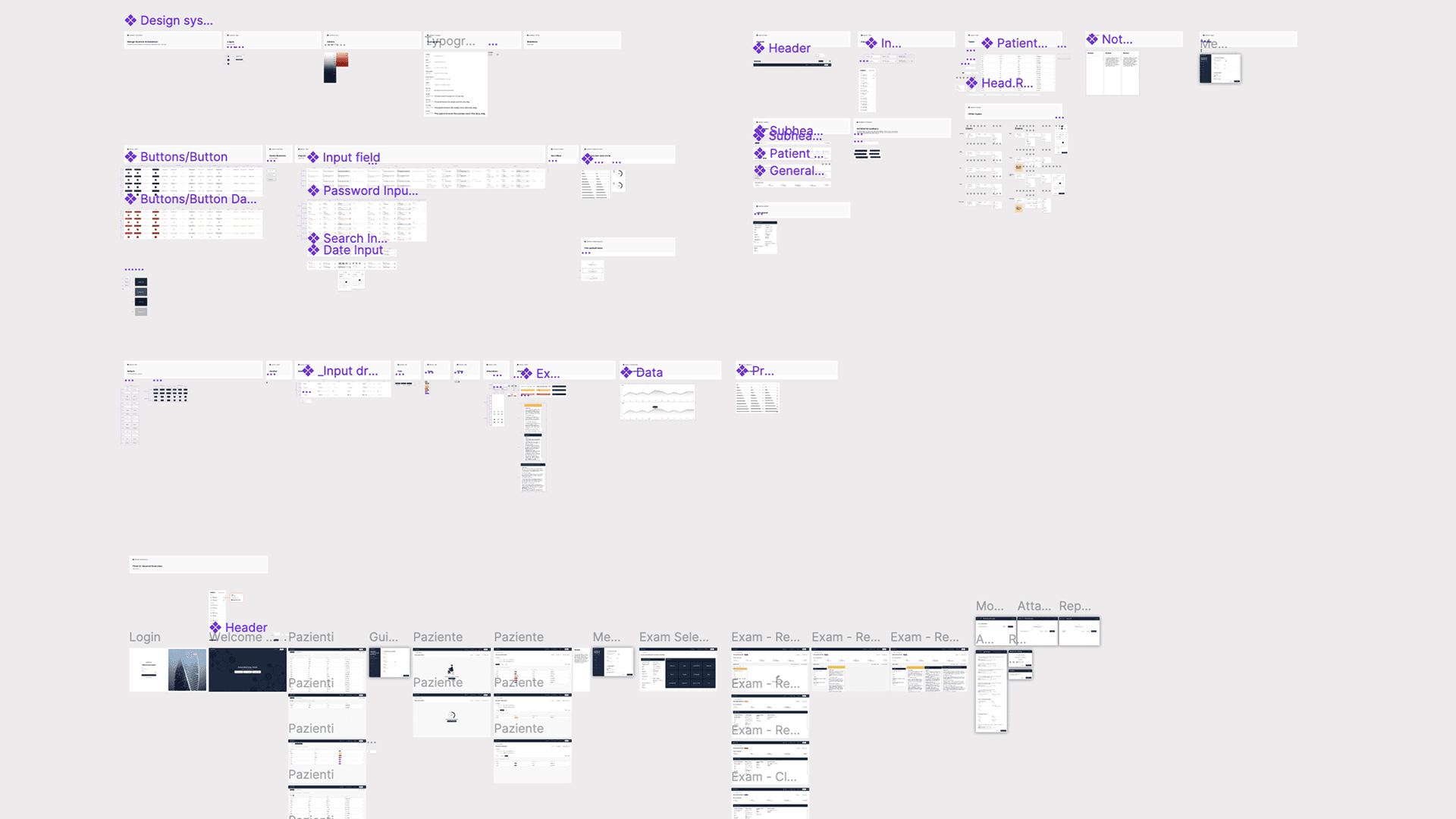
The component library I built here is the most complete I’ve delivered, and it’s now the basis for every test the laboratory offers.
It’s detailed enough for developers to build from directly. Every state is defined, every variant is drawn, and it all sits on the client’s existing brand.