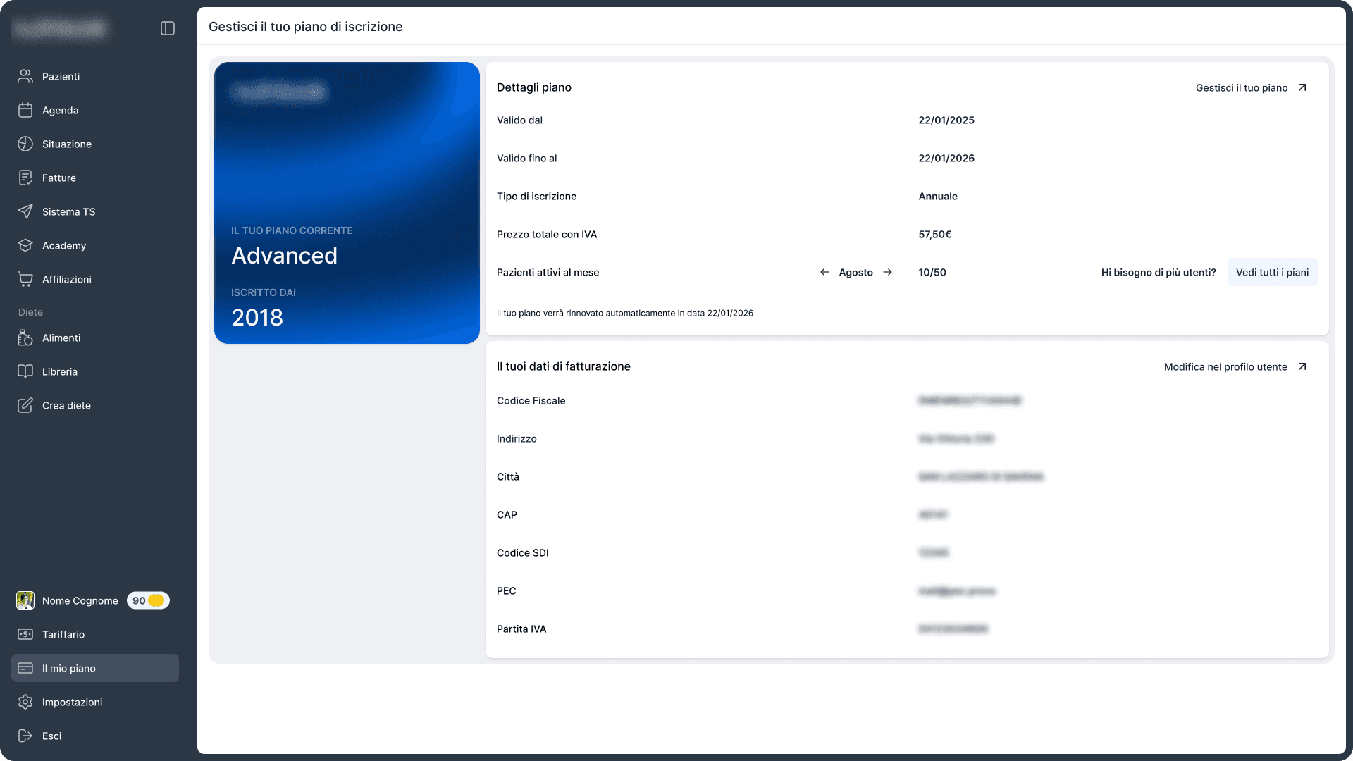
Nutritional Platform
A complete redesign of the platform 10,000+ nutrition professionals use every day.
- Working with
- Confidential
- Deliverable
- UI/UX · Design system
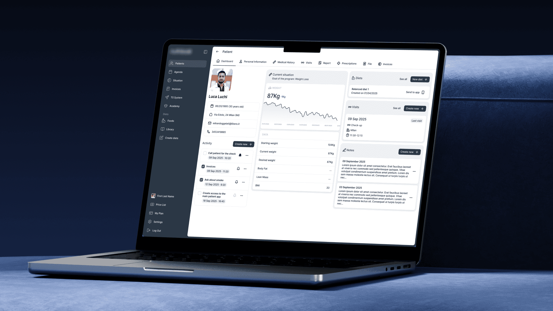
A redesign of software that nutritionists and their front-desk staff use every day: over 100 screens, dozens of flows and a design system built from scratch.
100+ Screens
No design phase to begin with
An internal team had built the original platform directly, with no design phase and no system behind it. It worked, and people had learned their way around it. That’s a different constraint from inheriting another designer’s work. There was no design intent to respect, only habits.
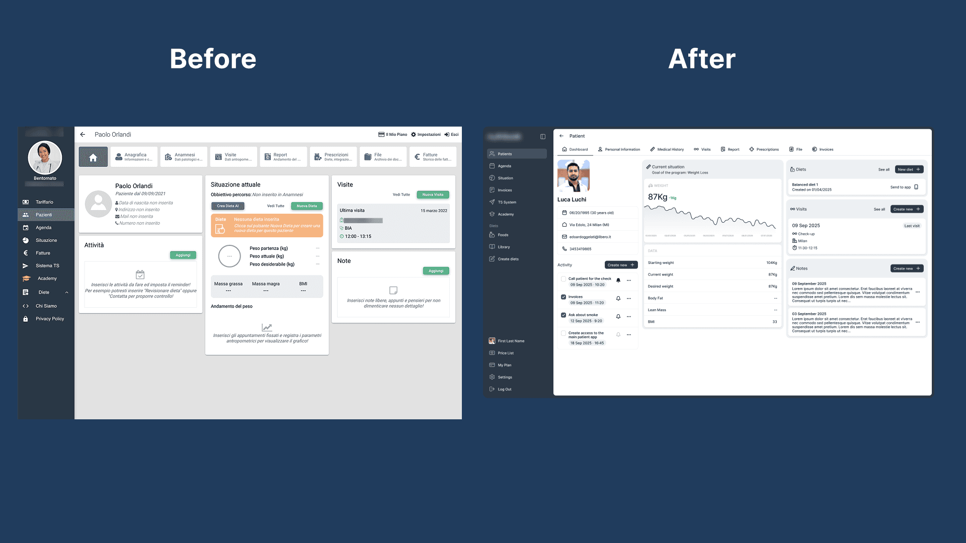
What changes, and what stays where it is
Ten thousand professionals open this every working day, so the redesign had a rule: improve the tool, don’t make them learn it again.
The structure stayed: the same three columns, in the same order, with the same section names. Patient details and activity are on the left, current status in the middle, visits and notes on the right. Someone who used the old platform on Friday finds everything in the same place on Monday.
What changed is how much emphasis each element gets within that structure. Navigation went from seven full-size tiles at the top of the screen to a single row of tabs, which freed up a quarter of the viewport. The current weight became the largest number on the page, with its change next to it, and the weight trend, which used to be a heading with nothing under it, became an actual chart.
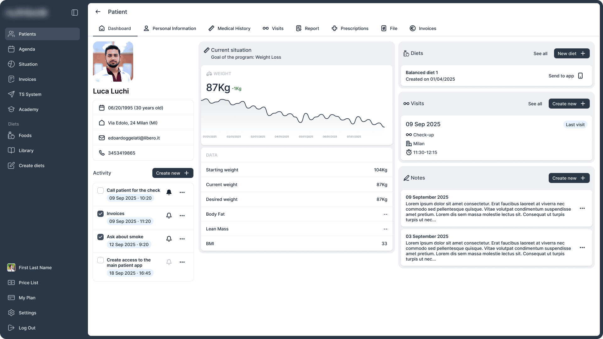
A design system where there wasn’t one
I built it specifically for this platform. Every component is defined and documented, so the internal development team can implement it without coming back with questions. It’s the first design system the product has had, and it’s what keeps 100+ screens consistent instead of 100+ separate decisions.